Continuing Logo Revisions
For this week, I take a few of the revised ideas and continue to develop them further.
This version is something that I like. The illustrated picture of the Granny herself is one option to explore.


Another option, this time going in a more cartoon style, with more stylized elements.
Taking the granny and refining her a bit more. In this iteration she was given glasses and more details in her face and hair.


Final rough idea. Taking a mix of both the cartoon style and the more detailed version.

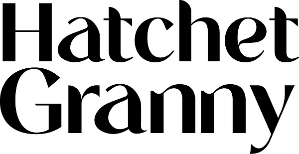
The final logotype treatment. This was used due to the line weights varying in the letters themselves. Using this line variation will influence the final logo as well, as I would like to have a sort of brush stroke effect in the final logo.
Final logotype, the letter A was changed from the more stylized version on top to a more traditional version to the right